COVID-19 Data Analysis
Purpose
I got off a call with a F1 Simulator Software Architect the other day. It was during our talk that Pandas was mentioned for processing data. I never heard of Pandas before, so I did my research after the call. I went to one of my full-time friends in the Vision Automation team at Tesla and asked him what is Pandas. He made the joke that it is like endangered species and then proceeded to tell me the actual software -- Pandas. He said it was a library in python that is used a lot to process dataset in Excel with a bunch of data. I was like SOLD! Anything to make my life easier and more learning! I had prior experience in python, Excel, and C# from UT Austin and Tesla so I was excited. I also want to code in Jupyter Notebook as well so used this project for it.
Thought Process
Overview
- Research on YouTube about Pandas
- Apply the knowledge by trying an example One of the Hackathon that I did recently we were using a big dataset for our product. We used Kaggle (a website that is free with one of the world's largest data sets).
Process Step
- Found a dataset that I was interested in analyzing https://www.kaggle.com/datasets/meirnizri/covid19-dataset?resource=download
- Install Jupyter Notebook: have to open terminal on the Jupyter Notebook location
- Install python (already have -- upgraded it)
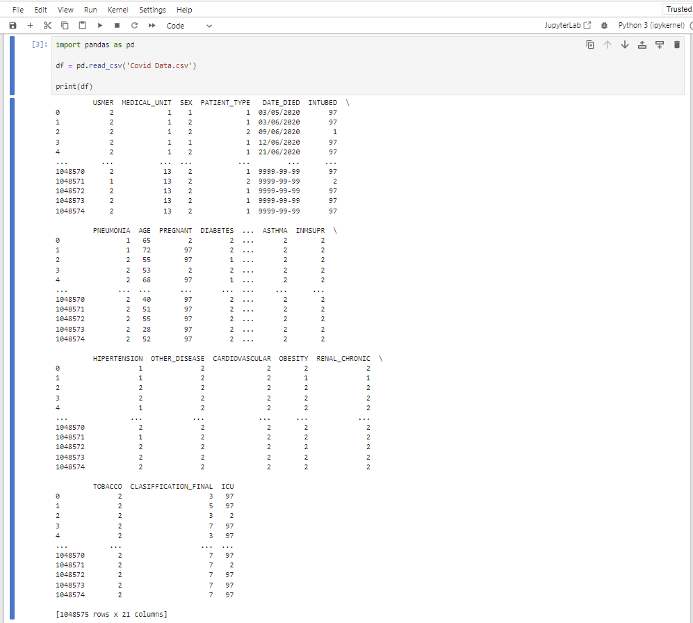
- Load dataframes for python to manipulate in Pandas Fix the indexing of the Excel with the Column A in Excel as 0 (zero)
- Read the csv data: rearranging the filtering the data
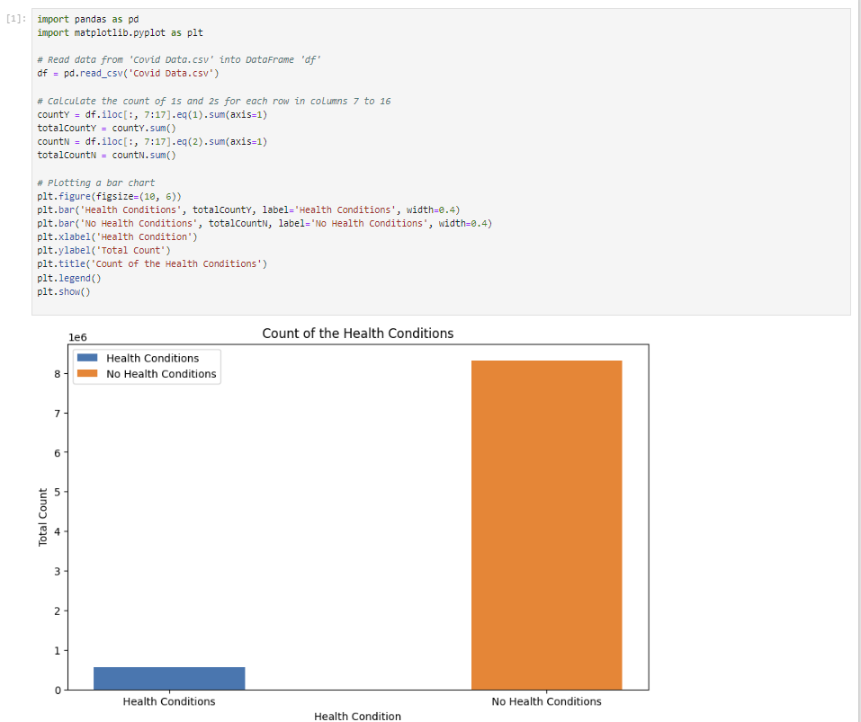
- Data charts: install matplotlib using pip install matplotlib Made a bar chart for statistical analysis of the count of people with pre-exisiting' health conditions vs no health conditions.
Challenges
- Needed to execute all the cells -- not just the plot code
- Made sure that there isn't another code cell that is causing an issue -- restarted the kernel and ran the cell again
- Isolate the plot code in a new Jupyter Notebook cell -- to isolate any interference from other cells.
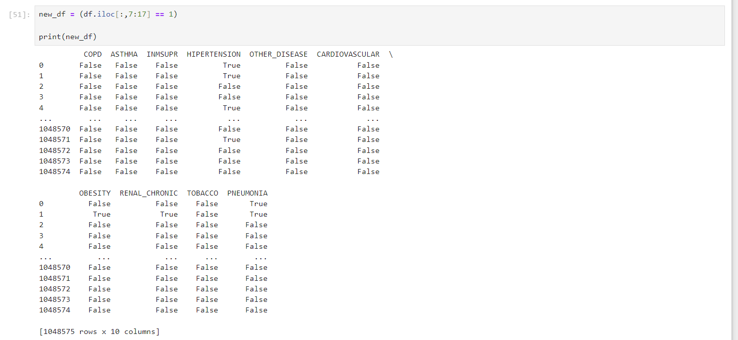
new_dfP = (df.iloc[:,7:17] == 1) | (df.iloc[:,7:17] == 2) to filter the original dataframe, but should be a
mask for selected rows that has values of either 1 "yes" or 2 "no".- Incorrect code:
plt.bar(new_dfP.index, countY, label = 'Health Conditions', width = 0.4) - Fixed code:
plt.bar(df.index, countY, label='Health Conditions', width=0.4)
countY = df.iloc[:, 7:17].eq(1).sum(axis=1);
										print(countY)
found out that the countY was adding a column of the total number of yes pre-existing health conditions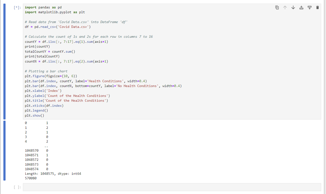
countY to be the total number of yes/no for the bar charttotalCountY = countY.sum();
print(totalCountY) plt.bar(df.index, totalCountY, label='Health Conditions', width=0.4);
plt.bar(df.index, totalCountN, bottom=totalCountY, label='No Health Conditions', width=0.4) figured that the "bottom" parameter isn't needed so
we can plot two bars side by side.
Skills Learned & Tips
- Filtering the data learned the difference from loc vs. iloc Loc is label indexing and can access multiple columns
- Messed up as
countN = (df.iloc[:,7:17].eq(2).sum(axis=1))instead hadcountN = (df.iloc[:,7:17].eq(2)) == 1since wanted to sum all the yes and no health conditions - It is important when learning a new language to figure out the proper document for the plots
- If install a new library or add-in, rerun and close the Jupyter Notebook because it won't work if so
Iloc is for integer indexing
Overall Thoughts
It was really fun learning a new library in python. It challenged me a lot since it has been a while since I had coded in python -- but it was quick for me to pick it up and think a way to opimtize the code faster instead of having too many iterations. I hope to spend more time learning about Pandas and its capabilities to process data a bit more since it has only been one day since I heard of the library. The bar chart wasn't showing up. I was up late trying to figure it out, but went to sleep and figured it out in the morning.